The main staircase at the British Embassy was designed by Lutyens to awe all visitors and make a grand statement. The entrance to the embassy is somewhat discreet.
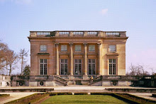
One arrives underneath a classical porte cochere in the center of the complex (underneath D on the plan above) and into the main stairhall; the residence is a piano nobile design which cleverly aids the hilly topography - but we'll get into that later.
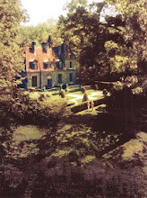
Symmetry and classical design reign on the exterior; a rather quiet facade gradually gives way to grandeur as one enters the residence.
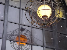
Many of the light fixtures throughout were custom designed - the fluorescent light bulbs are really unfortunate but do not hurt the fundamental beauty of the lantern.
Upon entering through french doors directly to one's left is a bust of the architect, Edwin Lutyens.
Light pours into the lower level from windows above inviting one up. Further emphasizing this ascent are the walls which turn from heavy Indiana limestone to a lighter plaster.
I loved the cascade of the lower risers which leads one to a short landing and the cloak rooms.
The most impressive detail of the space is the railing itself. Below is a sketch by Lutyens from early on in the design in 1925.
As you can see it didn't change much. This motif graces the endpapers of the new book on the embassy as well;
The Architecture of Diplomacy.
I love the furnished landings and I'll again point out the print gallery walls as well, installed in 2012.
Symmetry is key in the stair hall as throughout the residence. The interior window below to the right opens into an interior room: the morning room. Lutyens commonly designed such interior windows into his residential projects; supposedly so children could watch the festivities during parties! A false mirrored window stands opposite the landing to attain this perfect symmetry.
The placement of these ginger jars is perfection.
The ladies cloak room off the stairhall features Fornasetti's very stylish
'Teatro' wallpaper -manufactured by a very British company naturally,
Cole & Son. I loved these lanterns which flanked the opening.
The entry to the public spaces of the residence feature ornate plaster-work as well as lovely urns on pedestals.
A closeup of the plaster work reveals native flowers with classical figures.
Join me in following posts for more on the public spaces of the British Embassy.


4 comments:
Ironic that the bust of Sir Edwin Lutyens is flanked by two chairs...placed asymmetrically! Details of furniture misplacement drive me nuts. I'm forever trying to get housekeeping here to put back furniture exactly where it should be after they've been cleaning. It's a losing battle!
Columnist, you're right! I should have moved the chair -haha. I think a journalist had just been sitting in it and possibly moved it.
Even though the difference is so very slight, I have to say that I prefer the sketch of the railing to what was actually completed. The elements are more vertical and just a bit less lean-y. Though the railing is undeniably beautiful, it's the one thing, in the context of the rest of the building, that jars a bit for me....
Also, I wish the furniture used in this grand space was en suite. It looks a bit random. Oh, I do seem to be in a fussy mood! ;)
As an architect, it must be a joy to view this building and truly understand all that it took to be what it is.
Post a Comment